Think you knew everything there is to know about web design? In the world of brutalism you’d be shoving everything you learned about web design down the drain. A brutalist website defies best practices and challenges the status quo because being normal is too mainstream.
So scrap your hopes of finding any minimalist websites below because you will only discover sites that would leave you flabbergasted:
1) Balenciaga.com – French Luxury Fashion House
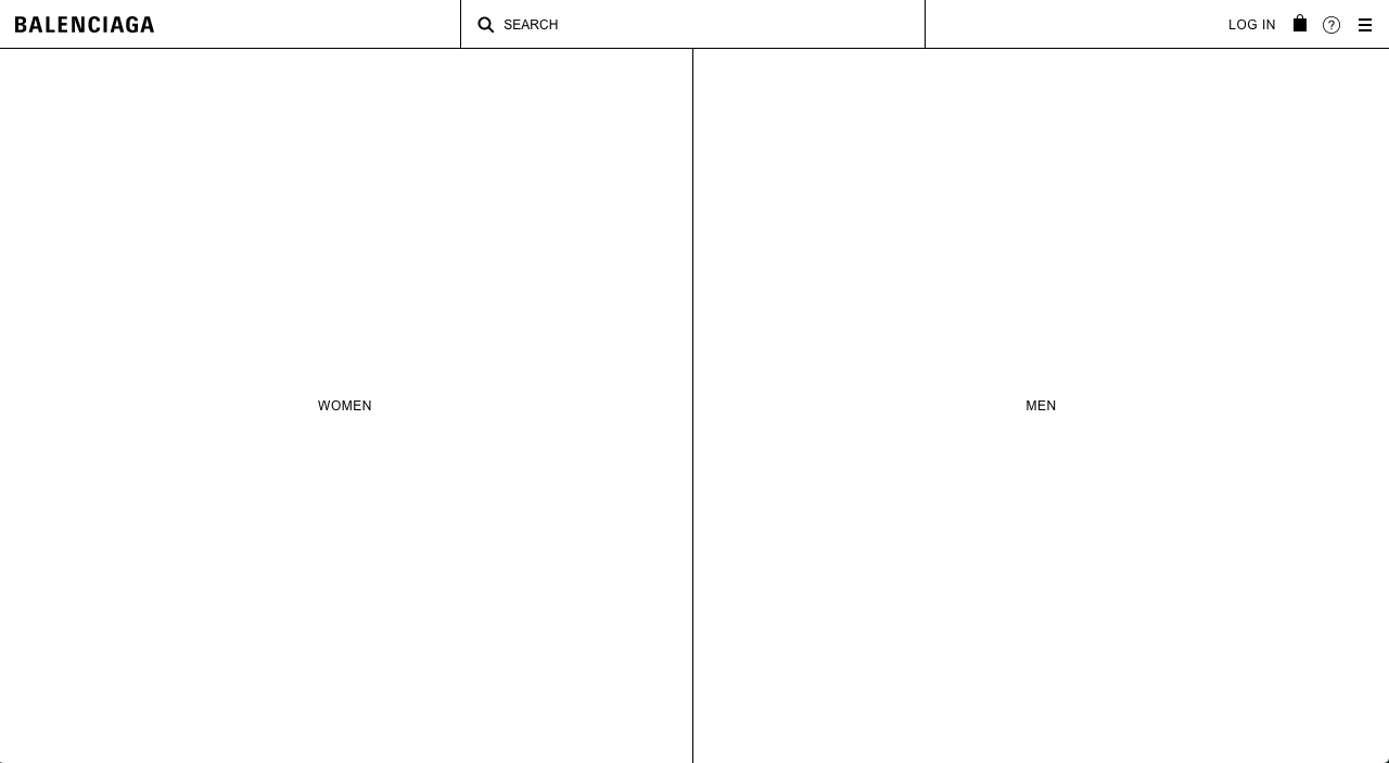 The image above looks more like an unfinished website, a wireframe – if you will, instead of an actual website. Surprisingly, it is the official website for Balenciaga, the French luxury fashion house.
2) Fiorucci.com – Italian Fashion House
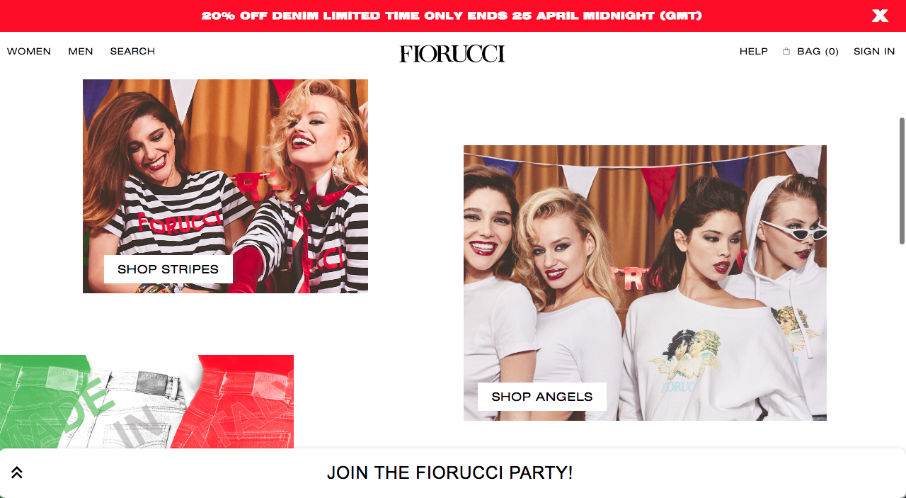 Fiorucci, the Italian fashion label is perhaps the only website that can don the compressed Helvetica font so perfectly. Shop categories are spread out using various-sized photos on their front page – not something you would have expected from a high-end brand.
3) Xxix.co – NYC Creative Studio
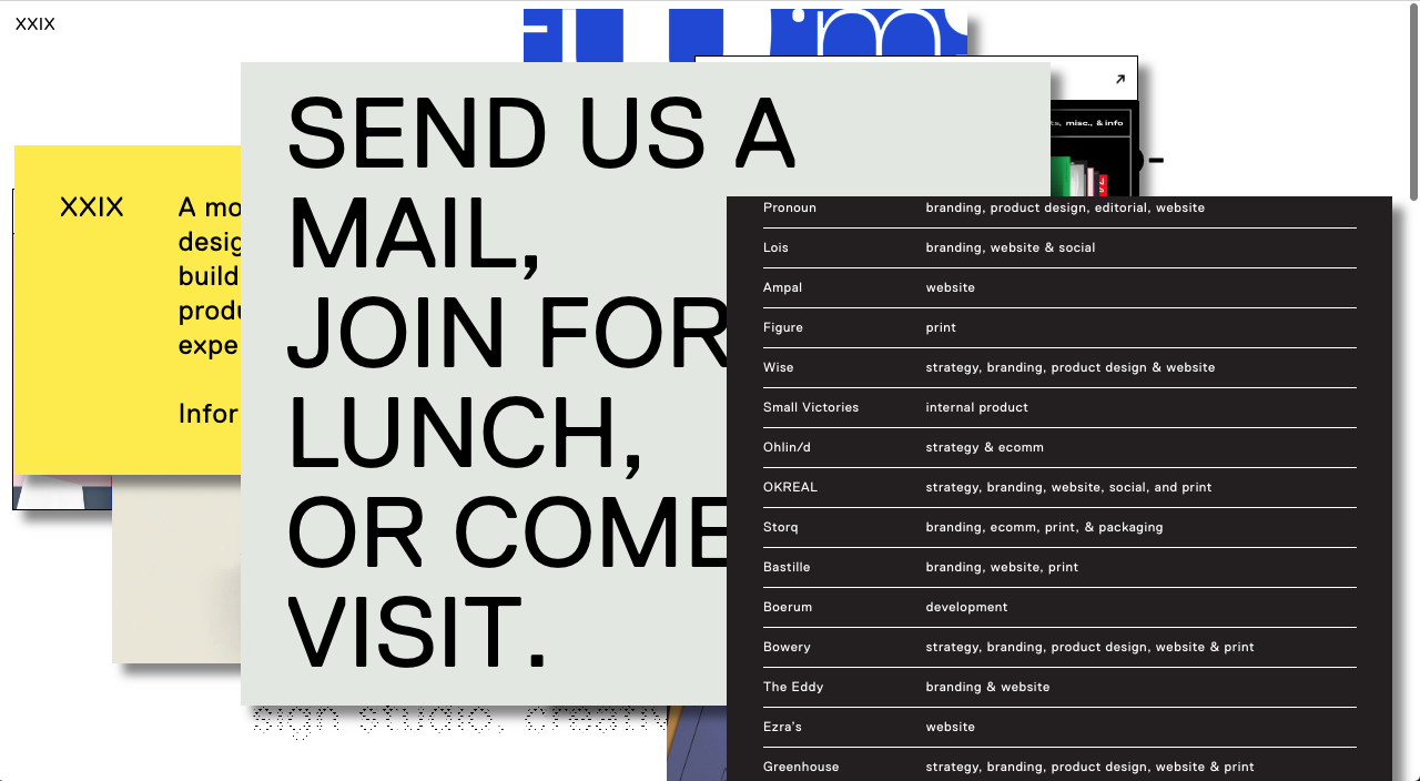 The Xxix site above belongs to a design studio in New York. The moment you entered their website you will be facing a window full of sticky notes-styled info. This practice is highly recommended if you wish your visitors to feel overwhelmed with information.
4) Chkchkchk.net - A weird website
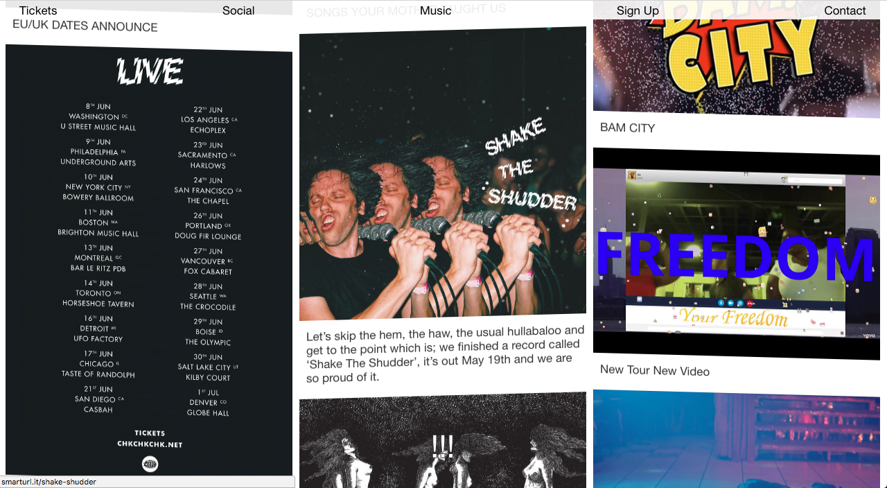 The first thing you would notice on Chkchkchk is a group of exclamation mark used as web cursor. As if that is not already strange enough, you would also see literal subtitles at the bottom of the browser window that makes absolute no sense.
5) Hawraf.com – The horizontal scrolling site
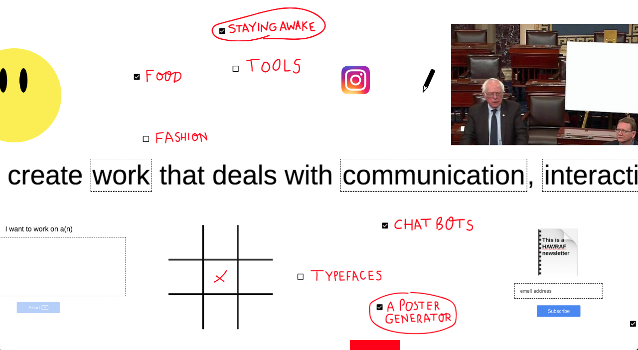 Hawraf.com is a unique website built to be scrolled horizontally – instead of scrolling up or down, you would be scrolling side to side. Besides, their entire page is a large canvas that you could doodle on with your mouse.
6) Cafelapetitereine.ch – Swiss café brutalist web design
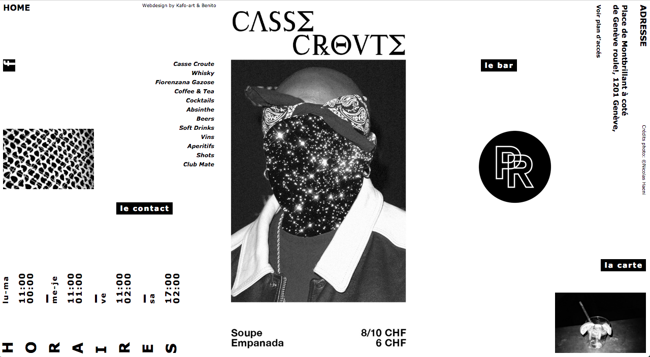 The Café La Petite Reine is Swiss café and perhaps the only café (we think?) that hopped on the brutalism bandwagon. Their website is designed almost like a trifold brochure with rotated texts so be prepared to tilt your head when checking out their site!
7) Chrissieabbott.com – A Creative Director’s Portfolio
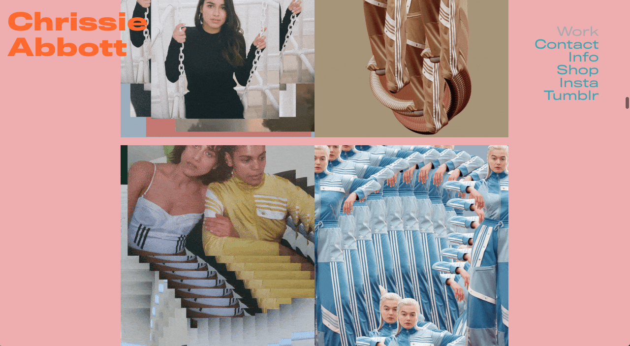 Chrissieabbott.com is not the average online portfolio that you would find on any other designer’s website. The creative director from London boasts a mind-boggling homepage filled with combination of strange GIFs, photos and weird colours.
8) Maxsiedentopf.com – A Mind-Blowing Portfolio
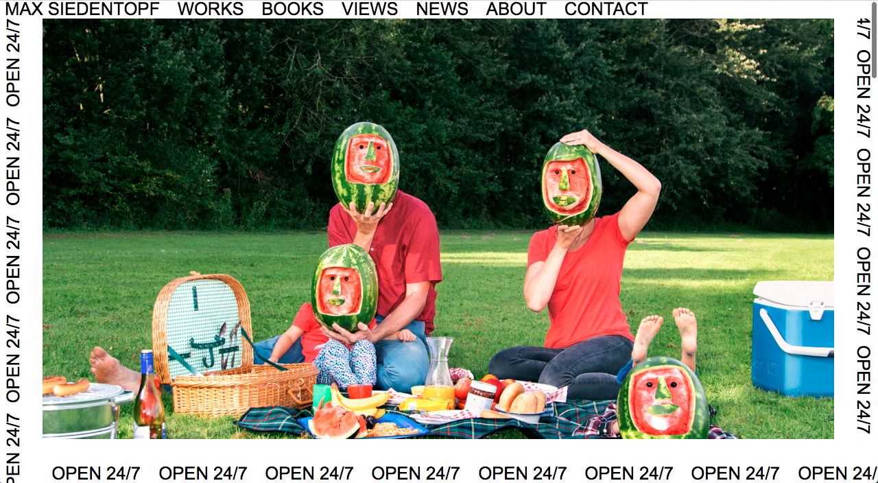 Just when you think you have seen it all… Need inspiration for art that does not make any sense? Max Siedentopf’s website is the right place to be. Family portrait with watermelon heads and car with cardboard side skirts because why not?
9) Lazyeyes.cool - Slot machine-styled project page
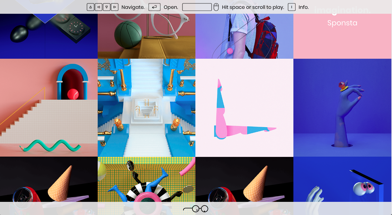 Like its URL suggest, Lazyeyes’s web page certainly do not disappoint. Their website is designed as such where you can interact with their portfolio like a slot machine! You will have to check it out for yourself.
10) Apelido-apelido.com - Fortune Cookie included
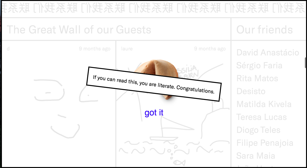
You can find out your daily fortune on apelido-apelido.com though we couldn’t guarantee that it will be of any help. What is guaranteed is that if you need a break from work, visit their website and just scribble on their visitor form. You might be featured on their “Great Wall of Guests”.
11) Highfivebro.com - BIG everything
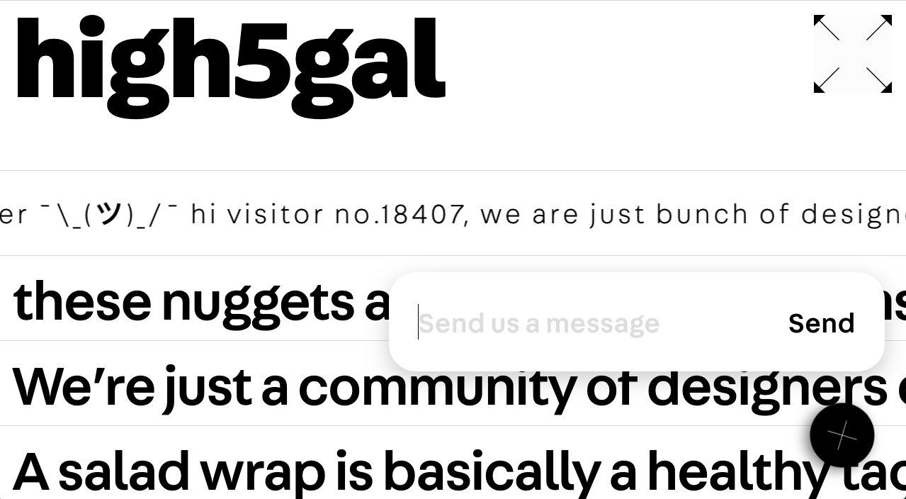 With their auto zoom scrolling script and huge letters, highfivebro.com is probably one of the most irritating website you would find on this list. We are not even surprised by the meaningless sentences because nothing makes sense anymore.
12) Florisschrama.nl - Hello World in Red
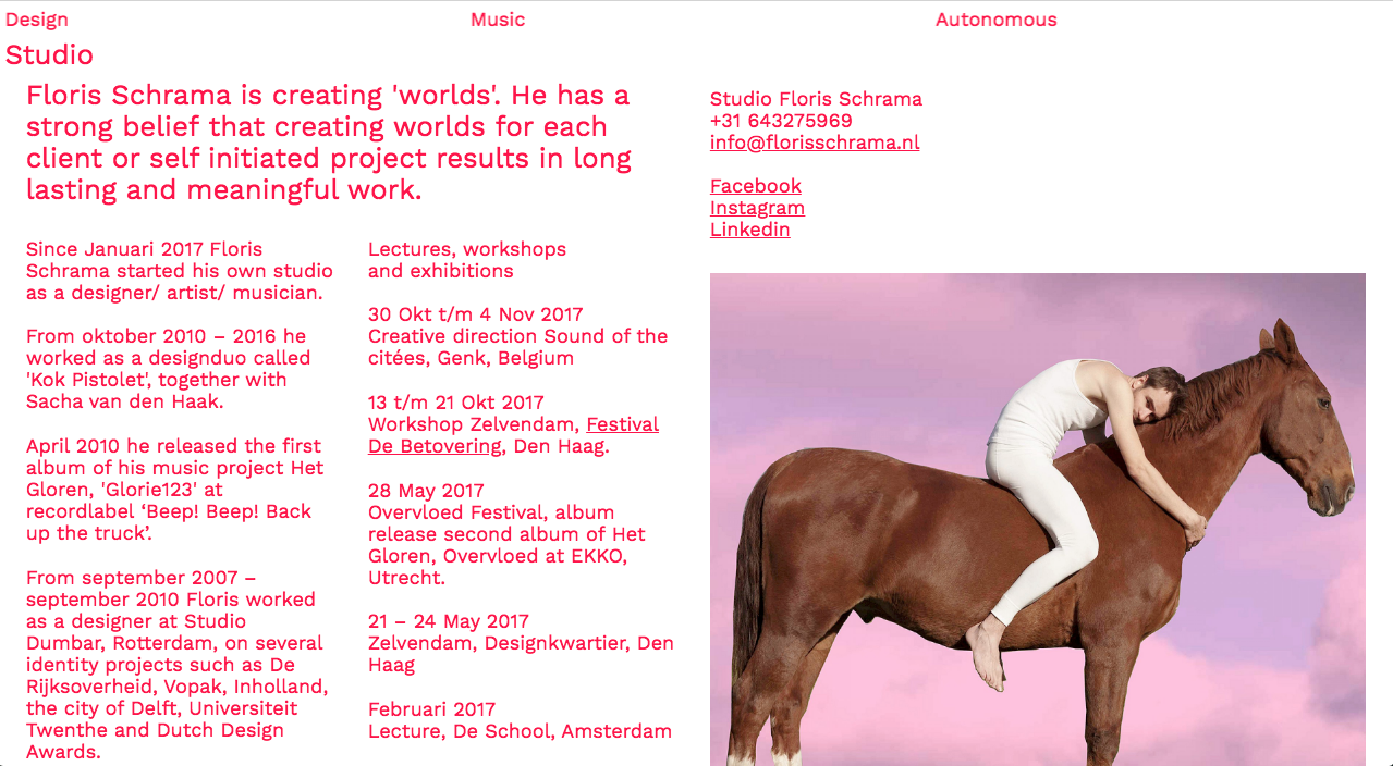 Ever been told not to use red texts on website? On Floris Schrama’s site you’re going to see a whole page of it along with a picture of man hugging a horse just because he can.
It’s in no doubt that brutalism in web design is most suited for cheeky designers and creative agencies. Going brutal seems to also be forgiven when you are a big name corporation like Balenciaga and Fiorucci.
Were the web developers high on something when they were building the website? No one knows. Suffice to say if you want your website to stand out from the minimalism crowd, brutal is the way to go.